Farewell Mies
In an earlier post this year, I wrote about Ludwig Mies van der Rohe and his prolific quotes that have driven design philosophies around the world. Mies and his mantras have been influential forces in my design philosophy, so much so that they enticed me to explore him on a much more personal level.
In 1955, following the completion of Mies’ infamous 860-880 North Lake Shore Drive high rise apartments in Chicago, 900-910 North Lake Shore Drive apartments were completed. These two 29-story buildings complemented his neighboring 26 story 860-880 apartments and were the first new buildings constructed on Lake Shore Drive since the 1920’s. Standing as mirrors in the skyline, towering over Lake Michigan, these four buildings would become Mies’ most radical expression of modern architecture and a testament to his “Less is More” philosophy. They’d also go on to redefine the modern American Skyscraper and Chicago skyline.
I have had the opportunity over the years to stroll by these magnificent structures in the hopes of getting inside to marvel at their brilliance, never with any success. Years ago, our daughter, an urban dweller in Chicago, was looking for a place to live as the end of her lease was approaching. In this next move she wanted to shed the roommates and make a run at city living without having to share the burden of rent and all the other things that go along with having a roommate. As she searched the city for a location and price that was within her budget, she came across an apartment for sale in the 900 North Lake Shore Drive building. Not hesitating, she called and let’s just say it was a short conversation. My wife and I bought the unit, our daughter resided in it, and I finally had the privilege of not only experiencing but living in a Mies van der Rohe original. The buildings I’d spent years admiring, and we now owned a piece. On the first day, stepping foot on the property, I understood in a whole new way what a brilliant Architect he was.
Located in the Streeterville neighborhood of Chicago, a quiet area in the Northeastern part of the city, these buildings rise out of the ground with prominence and grace. Standing on two story steel columns, the buildings hover above Mies’ signature plaza, the ground plane clad in travertine and the lobbies seamlessly engaged with the exterior. Gridded metal facades and raised I-beam mullions express the structure holding the building together. These revolutionary design features would define his architecture for the balance of his career and go on to be absorbed by so many designers to come.
Inside the lobby walls are clad in Mies’ signature green travertine and serve as a gallery for his infamous Barcelona chairs. At every turn there is thoughtfulness in each detail. Even the enclosed stairways that serve as the exit from the upper floors weren’t ignored. I marveled every time I used them as the handrail became a weaving singular piece of steel unbroken from the 29th floor down to the first.
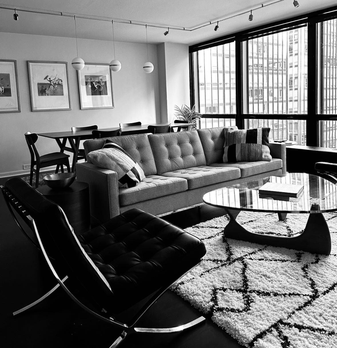
Inside the apartment, the thoughtfulness was evident. This unit had the original 1955 Republic Steel Kitchen Cabinets (one of the drivers for purchasing it as they are now so rare) designed by Mies. Non-loadbearing walls allow users to ultimately shape their interiors to fit their lifestyle. Wall-to-wall and floor-to-ceiling glass spill natural light into a large, open living area unencumbered by walls or divisions that visually connects to the cityscape. So many modern attributes throughout the building paved the way for the future of not only apartment living, but commercial high rise office buildings as well.
We recently sold our iconic piece of Mies but it reinforced in me his mastery and principals as a designer. Smart design is good design, and simple design is great design.
Less is More – Farewell Mies!


